Histograms with SQL
Copy / paste and run these code snippets to do your own exploratory data analysis with SQL.

A data visualization is better than words if you want to explain how a product is used, what's an edge case, and where there might be opportunity for impact. In this post I'll show you how to create histograms in SQL.
Let's start with an example using the 2022 NYC Taxi Fares dataset.
Quantiles
APPROX_QUANTILES is the quickest way to visualize a distribution in BigQuery.
SELECT APPROX_QUANTILES(total_amount, 9)
FROM `bigquery-public-data.new_york_taxi_trips.tlc_yellow_trips_2022`
With the code above we create 9 boundaries defined by a range of taxi fares (total_amount) to contain 10 bins (aka buckets) where each bin has the same number of rides.
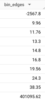
Because our dataset includes about 36 million rides, we know each bin includes about 3.6 million rides. So there were about 3.6 million rides that cost less than $9.96 and there were about 3.6 million rides that cost between $9.96 and $11.76, and so on.
Looking at this distribution, we can make an educated guess that the median ride fare is about $15-16 – there are an equal number of rides on each side of this price point.
Median in SQL
In BigQuery we need to use PERCENTILE_CONT() or PERCENTILE_DISC() to calculate median. (Snowflake has its own Median function.)
SELECT PERCENTILE_CONT(total_amount, 0.5) OVER() median
FROM `bigquery-public-data.new_york_taxi_trips.tlc_yellow_trips_2022`
LIMIT 1
With the code above we confirm that the median price for a ride in 2022 was $15.95.
Now we have a rough idea about the shape of this dataset. We can talk about a "typical" ride. And we see there are some outliers at the edges. But the big picture is still fuzzy. Let's use SQL to get even more articulate about what this dataset looks like.
Histogram in SQL
Here it is, a histogram in table form. Scroll to see the code.
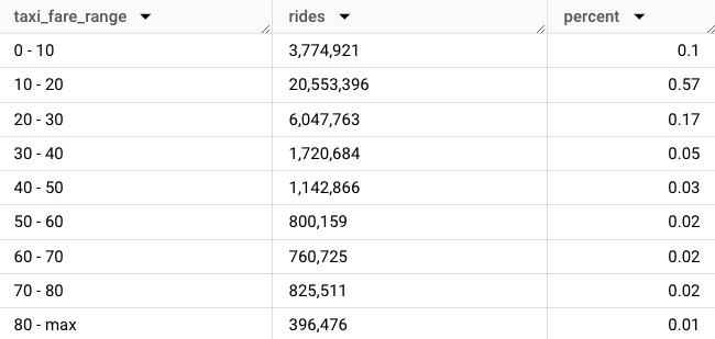
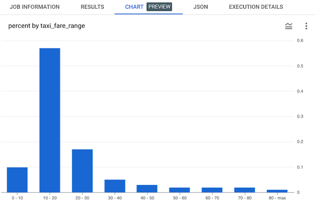
In 2022, 58% of all rides cost less than $20. 1% of rides cost $80 or more. A table is the simplest, and often best, representation of a distribution.
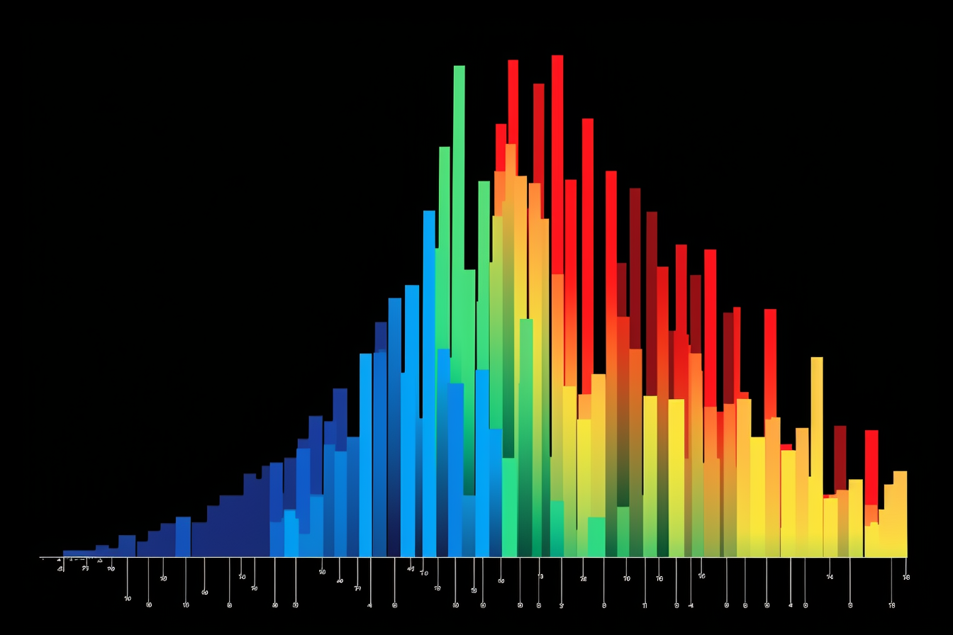
BigQuery lets us toggle between the query result (the table above) and a histogram chart. Now we're getting a real feel for the shape of the dataset.
Here's the code I used to generate the result. As you'll see shortly, this code can be easily repurposed to visualize the distribution of almost any dataset.
DECLARE bin INT64 DEFAULT 10;
DECLARE outlier FLOAT64 DEFAULT .99;
SET outlier = (SELECT PERCENTILE_CONT(total_amount, outlier) OVER() from `bigquery-public-data.new_york_taxi_trips.tlc_yellow_trips_2022` WHERE total_amount > 0 limit 1);

WITH cleaned as (
SELECT
  total_amount,
  outlier,
  (case when total_amount > outlier then outlier else total_amount end) clean
FROM `bigquery-public-data.new_york_taxi_trips.tlc_yellow_trips_2022`
WHERE total_amount > 0
)

SELECT
  FLOOR(clean / bin * 1.0) * bin flr,
  CASE WHEN FLOOR(outlier) >= (FLOOR(clean / bin * 1.0) * bin) AND FLOOR(outlier) < (FLOOR(clean / bin * 1.0) * bin + bin) THEN FLOOR(clean / bin * 1.0) * bin || ' - max' else FLOOR(clean / bin * 1.0) * bin || ' - ' || (FLOOR(clean / bin * 1.0) * bin + bin) END AS taxi_fare_range,
  FORMAT("%'d", COUNT(*)) AS rides,
  ROUND(COUNT(*) * 1.0 / (SELECT COUNT(*) FROM cleaned),2) percent
FROM cleaned
GROUP BY 1,2
ORDER BY 1 ASCHow the code works
- First, we declare and set our variables to define the parameters of the histogram, and to keep our code DRY (don't repeat yourself). These variables –
binandoutlier– are important and they're explained in the next section. - In the middle CTE we clean up the data, because like most datasets, this one includes some bad data (fares that are less than zero dollars), and also some extreme outliers which we will store in the last bin "80 - max".
- In the final SELECT statement we dynamically name our bins so a reader knows the range of ride fares in a given bin. We count the number of rides in each bin (formatted to include commas so these big numbers are easier to read). And we return a third column "percent" to represent the relative quantity of rides in each bin.
Bins / buckets
Bin size is the constant interval we use to define the "width" of each bar in the histogram. Every dataset has a different "correct" bin size. Many datasets have multiple correct bin sizes. For this taxi fare dataset $10 works because it corresponds in the real world with discrete steps up from a cheap ride to a twenty dollar bill to an expensive ride. A $10 bin has real life implications which can be felt by someone who is reading your chart. And when the data is visualized, it creates a familiar right skewed curve that has easily interpreted implications on your business.
Outliers
All big datasets have outliers. These are observations that are exceptional, and which might distract from the rational interpretation of a business problem. For a right skewed distribution like the taxi fare dataset, where low value observations are more common than high value observations, most of the outliers will exist to the right. This is what our chart would look like if we did not account for outliers.
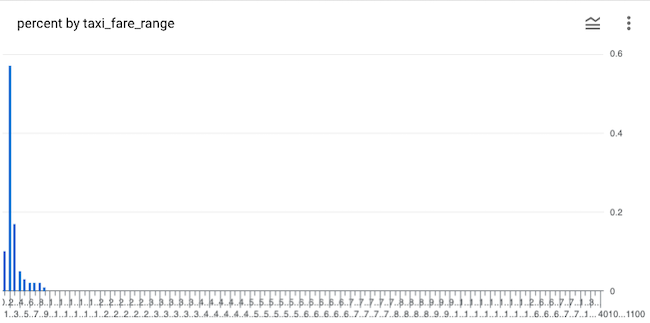
Although 99% of all fares are less than $90, the exceptionally expensive 1% of rides are spread thinly across our x-axis, filling up our chart with white noise. Don't share a chart like this at work. Make your chart more visually digestible by accounting for outliers by declaring and setting a variable...
DECLARE outlier FLOAT64 DEFAULT .99;
SET outlier = (SELECT PERCENTILE_CONT(total_amount, outlier) OVER() from `bigquery-public-data.new_york_taxi_trips.tlc_yellow_trips_2022` WHERE total_amount > 0 limit 1);
... and then include your outliers in your last bin.
CASE WHEN FLOOR(outlier) = (FLOOR(clean / bin * 1.0) * bin) THEN FLOOR(clean / bin * 1.0) * bin || ' - max' ELSE
    FLOOR(clean / bin * 1.0) * bin || ' - ' || (FLOOR(clean / bin * 1.0) * bin + bin) END AS taxi_fare_range
A step further: visualizing revenue
So now we have created a histogram to visualize the distribution of rides across fare ranges. But we don't just care about rides, we also care about revenue. So let's take the SQL query a step further to understand how much each fare range contributes to total revenue.
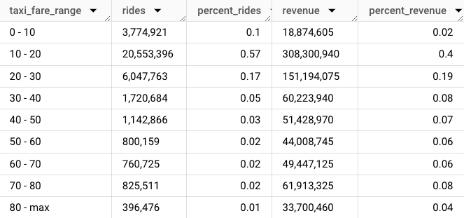
Here's the result in table form.
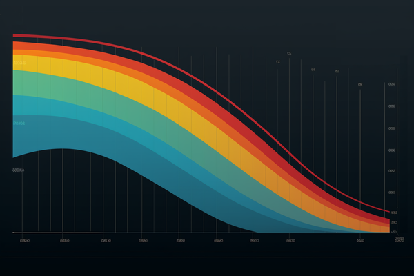
In BigQuery we can turn this into a two-series bar chart comparing % rides and % revenue across fare ranges.
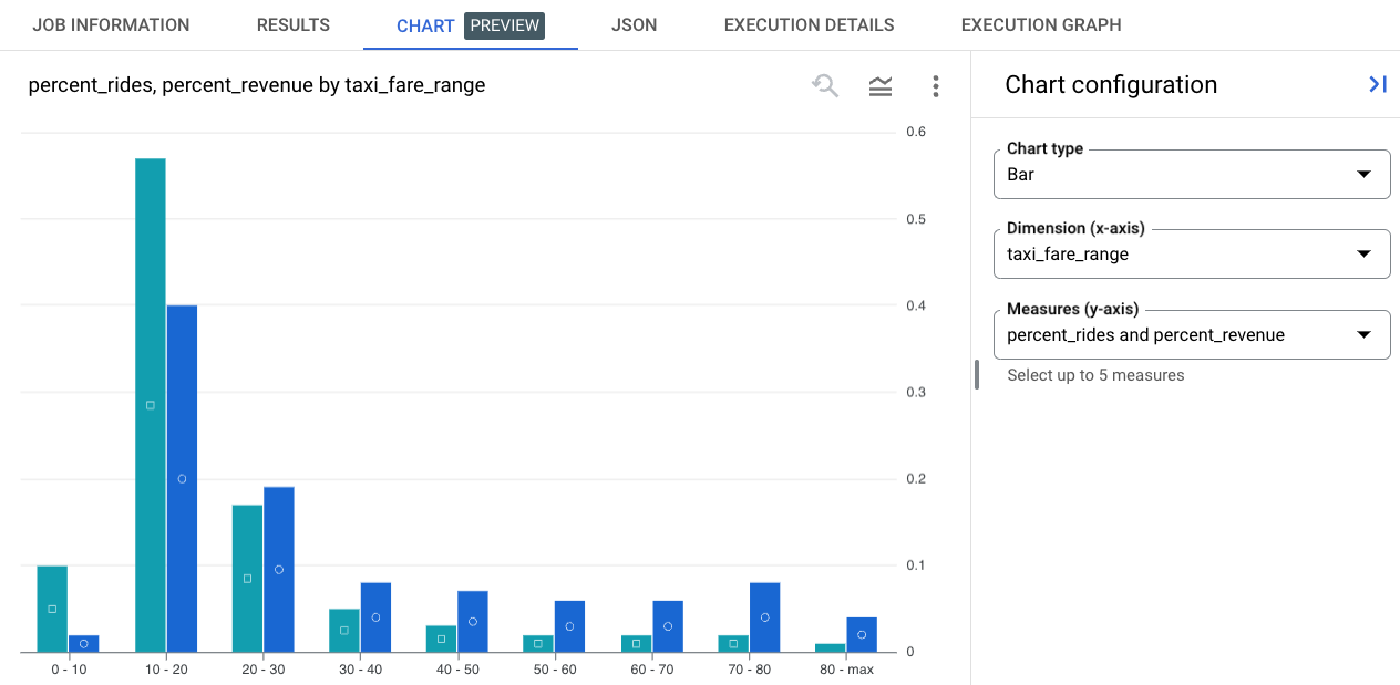
We see that rides under $30 account for 75% of all rides and 60% of revenue and rides over $60 account for only 5% of rides, but nearly 20% of revenue.
Here's the code:
DECLARE bin INT64 DEFAULT 10;
DECLARE outlier FLOAT64 DEFAULT .99;
SET outlier = (SELECT PERCENTILE_CONT(total_amount, outlier) OVER() from `bigquery-public-data.new_york_taxi_trips.tlc_yellow_trips_2022` WHERE total_amount > 0 limit 1);

WITH cleaned as (
SELECT
  total_amount,
  outlier,
  (case when total_amount > outlier then outlier else total_amount end) clean
FROM `bigquery-public-data.new_york_taxi_trips.tlc_yellow_trips_2022`
WHERE total_amount > 0
),

data as (
SELECT
  CAST(FLOOR(clean / bin * 1.0) * bin as int) flr,
  CASE WHEN FLOOR(outlier) >= (FLOOR(clean / bin * 1.0) * bin) AND FLOOR(outlier) < (FLOOR(clean / bin * 1.0) * bin + bin) THEN FLOOR(clean / bin * 1.0) * bin || ' - max' else FLOOR(clean / bin * 1.0) * bin || ' - ' || (FLOOR(clean / bin * 1.0) * bin + bin) END AS taxi_fare_range,
  FORMAT("%'d", COUNT(*)) AS rides,
  COUNT(*) ridesx,
  ROUND(COUNT(*) * 1.0 / (SELECT COUNT(*) FROM cleaned),2) percent_rides
FROM cleaned
GROUP BY 1,2
ORDER BY 1 ASC
)

SELECT
  flr, taxi_fare_range, rides, percent_rides,
  FORMAT("%'d", ((flr + 5) * ridesx)) revenue,
  ROUND(((flr + 5) * ridesx) / (SELECT SUM(total_amount) FROM cleaned),2) percent_revenue
from data
order by 1 asc;
Let's look at another example...
Example: Stack Overflow reputation
We can use the same code with almost any dataset to visualize the distribution of observations. Let's have a look at reputation for Stack Overflow users.
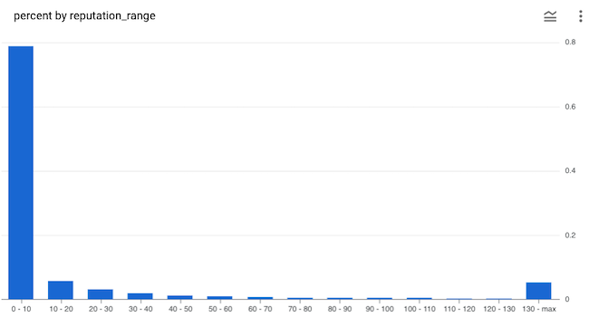
In the code (shared below) we again use a bin size of 10, but this time we set the outlier to 95% to reduce the number of bins shown in the histogram (at 99% there would be 142 bins). Here it's pretty obvious that outliers are getting lumped into the last bin. This is useful to visualize – there is a meaningful number of users with high reputation.
DECLARE bin INT64 DEFAULT 10;
DECLARE outlier FLOAT64 DEFAULT .95;
SET outlier = (SELECT PERCENTILE_CONT(reputation, outlier) OVER() from `bigquery-public-data.stackoverflow.users` limit 1);

WITH cleaned as (
SELECT
  reputation, outlier,
  (case when reputation > outlier then outlier else reputation end) clean
FROM `bigquery-public-data.stackoverflow.users`
)

SELECT
  FLOOR(clean / bin * 1.0) * bin flr,
  CASE WHEN FLOOR(outlier) > (FLOOR(clean / bin * 1.0) * bin) AND FLOOR(outlier) < (FLOOR(clean / bin * 1.0) * bin + bin) then FLOOR(clean / bin * 1.0) * bin || ' - max' else FLOOR(clean / bin * 1.0) * bin || ' - ' || (FLOOR(clean / bin * 1.0) * bin + bin) end reputation_range,
  COUNT(*) AS users,
  ROUND(COUNT(*) * 1.0 / (SELECT COUNT(*) FROM cleaned),3) percent
FROM cleaned
GROUP BY 1,2
ORDER BY 1 ASCLet's look at one more example.
Example: Penguin Weight
BigQuery includes a fun little public penguin dataset. Here's the distribution of penguins by weight.
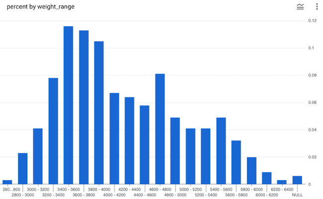
That's a funny looking distribution. When a distribution has two peaks there is usually something going on beneath the data. What could it be?
DECLARE bin INT64 DEFAULT 200;
DECLARE outlier FLOAT64 DEFAULT null;
SET outlier = (SELECT PERCENTILE_CONT(body_mass_g, outlier) OVER() from `bigquery-public-data.ml_datasets.penguins` limit 1);

WITH cleaned as (
SELECT
  body_mass_g, outlier, species,
  (case when body_mass_g > outlier then outlier else body_mass_g end) clean
FROM `bigquery-public-data.ml_datasets.penguins`
)

SELECT
  FLOOR(clean / bin * 1.0) * bin flr,
  CASE WHEN FLOOR(outlier) > (FLOOR(clean / bin * 1.0) * bin) AND FLOOR(outlier) < (FLOOR(clean / bin * 1.0) * bin + bin) then FLOOR(clean / bin * 1.0) * bin || ' - max' else FLOOR(clean / bin * 1.0) * bin || ' - ' || (FLOOR(clean / bin * 1.0) * bin + bin) end weight_range,
  COUNT(*) AS penguins,
  COUNT(CASE WHEN species = 'Adelie Penguin (Pygoscelis adeliae)' then 1 else null end) adelie,
  COUNT(CASE WHEN species = 'Chinstrap penguin (Pygoscelis antarctica)' then 1 else null end) chinstrap,
  ROUND(COUNT(*) * 1.0 / (SELECT COUNT(*) FROM cleaned),3) percent
FROM cleaned
GROUP BY 1,2
ORDER BY 1 ASCDid you learn something from this post? See an error or have an observation? Leave a comment!
Other posts in this series: